I think many underestimate just how hard it is to create a good movie or TV poster. There are a plethora of amateur designers with Tumblr accounts turning out cool movie posters for fun every day. And if an amateur can create a cool poster for (say) Star Wars or Pulp Fiction, then surly they’d be great at creating real posters for upcoming releases too. Right?
Not quite. I think what many tend to forget is that the types of posters these fans of the media are creating all rely on viewers already having seen the movie they’re promoting. If you’ve never seen (say) Star Wars of Pulp Fiction then their posters can be a confusing mess of design elements that may look neat to those who are familiar with the movie, but not make sense to the uninitiated viewer.
Creating movie posters that sell something brand new the public’s never seen before is tough stuff and the posters below do that and do it quite well.
Click on any of the posters below for a larger view.
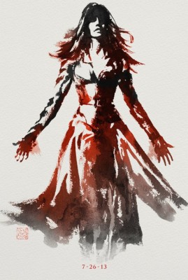
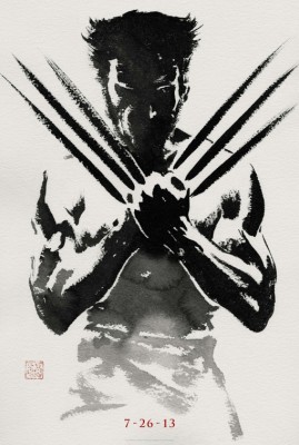
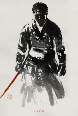
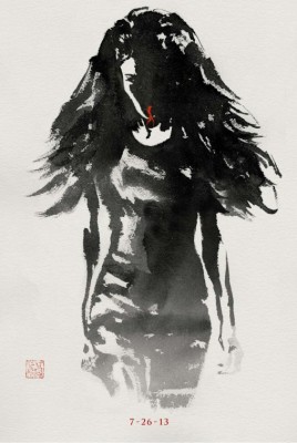
The Wolverine
Let’s face it, most movie posters are less art than pure marketing. There are loads of posters that follow trendy design patters like “giant heads in the sky” or, more recently, posters that feature the backs of characters. That’s why I take note when the designers of a movie poster campaign do something different, like the creators of the character posters for the movie The Wolverine did this year with their character posters.
Here, rather than going for the slick photographic look almost all posters use these days, the character posters for The Wolverine are instead illustrated by, I think, old-school brush and ink. These posters are beautiful, unique and are unlike anything else I’ve seen this year.
Plus these posters show that the character poster, which has become ubiquitous and just as boring for just about every big-budget release in recent years, can be fun and interesting and well designed too.
Heck, I’d call these posters the closest thing we’ve seen to “art” in the form for a long while.
Gravity
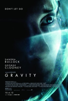
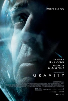
When movies star famous actors, it’s a good bet said actors will get their mugs plastered all over posters promoting said movies. While the posters for the movie Gravity do feature images of the the two lead actors, Sandra Bullock and George Clooney, I wouldn’t exactly say that the posters feature the actors in a flattering light. Here, the designers of the Gravity posters decided to fill the frame with the faces of the actors, almost to the point of having the faces too close/cropped and claustrophobic, and lit the faces in a stark blue-green hue. All of which adds a subtle layer of tension, not usually found in most movie posters.
Plus it’s got the best tagline of the year, “Don’t let go.”
Mad Men & The Walking Dead
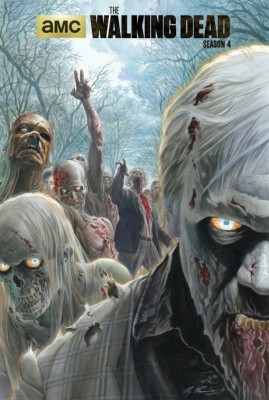
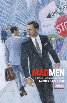
Another set of beautifully illustrated posters are those for Mad Men and The Walking Dead on AMC. The Mad Men poster, illustrated by a real-life 75 year old real ex-mad men illustrator Brian Sanders, is gorgeous and perfectly harkens back to the time of the series. The Walking Dead poster, by illustrator Alex Ross, is a living terror. It puts the viewer in the unenviable position of being the target of the zombie’s next meal.
Veep
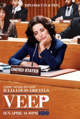 If there’s a poster that totally nails the current state of politics here in the US, it’s the poster for the HBO series Veep. Here, the lead character of Selina Meyer (Julia Louis-Dreyfus) is shown sitting and dozing as a delegate of the United Nations. Plus I love the double meaning of the tagline, “Diplomacy in action.”
Some posters that didn’t quite make the cut include the TV series American Horror Story, True Blood, Strike Back and Sons of Anarchy.
