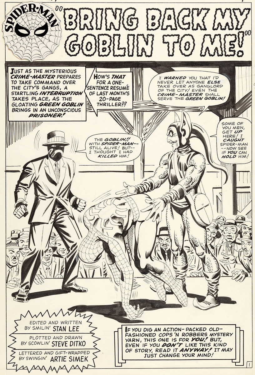
Tag: spider-man
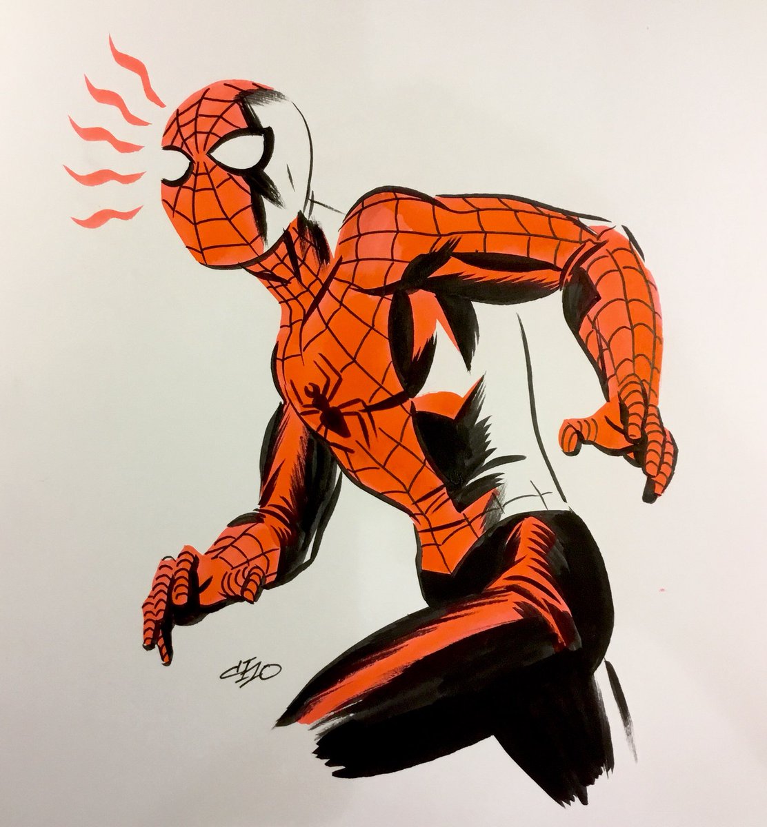
Michael Cho Spider-Man drawing

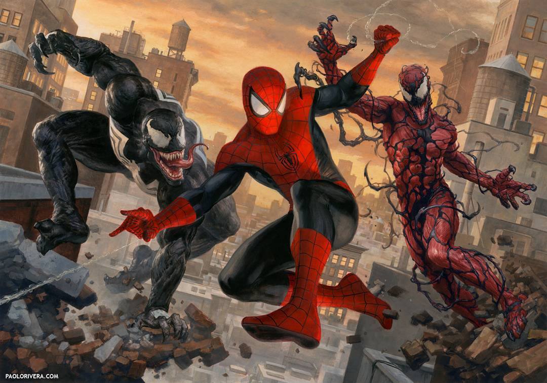
Paolo Rivera Spider-Man, Venom & Carnage painting
Opening Credits Sunday: Supaidāman (Spider-Man) 1978
The best movie & TV posters of 2017
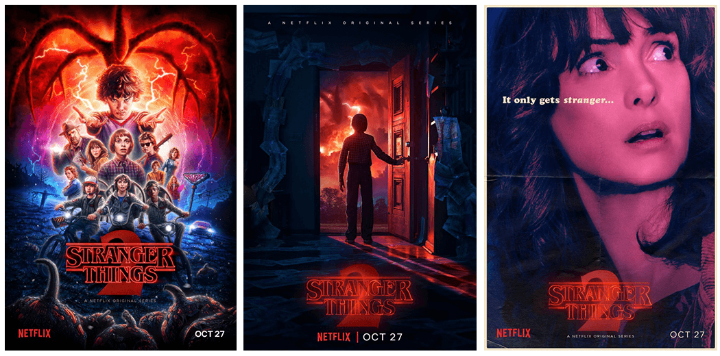
The best posters of 2017 were for the TV series Stranger Things.
Stranger Things
Not too many posters these days are illustrated. There was a time when all posters were, but that time ended with the advent of Photoshop where photos of the actors could be used in lieu of having an artist draw/paint them. But recently that’s changed a bit, especially with the company Mondo creating old-school illustrated posters. And to a certain extent Hollywood’s followed their lead and has produced a number of illustrated posters for big-budget movies. So it’s no surprise an outlet like Netflix would have one of their shows feature an illustrated poster too. What is surprising is how well the illustrated poster for Stranger Things turned out. Illustrator Kyle Lambert created this poster and the attention to detail on it is astounding. This poster manages to be both modern and have a classic 1980s movie poster touch at the same time.
I also like the non-illustrated posters for Stranger Things too. They all work together well as a set and evoke the theme of the series in just a few images.
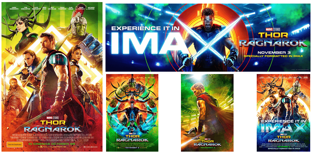
Thor: Ragnarok
The posters for Thor: Ragnarok shouldn’t work, but they really do. The colors of them are hyper acidic and I get a sugar high just looking at them. I think what makes these posters work is that they still look like the standard Marvel movie posters, but because of the choice to use these colors make them unlike any Marvel movie poster that’s come before. I know I’ve always said I judge the best posters of the year based on whether or not I’d like to have them hanging on the walls of my office. But the posters for Thor: Ragnarok might be the exception to the rule. I adore these posters, but having to stare at them every day on the wall my be too much for my weak psyche to take.
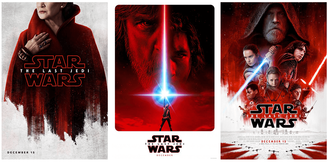
Star Wars: The Last Jedi
Much like with the posters for Thor: Ragnarok, the posters for Star Wars: The Last Jedi don’t look like any other Star Wars poster I can think of yet still feel like posters for a Star Wars movie. To me the standard Star Wars poster has a bunch of characters on either black or white, and if the movie came out pre–2015 was probably illustrated by Drew Struzan. Except the posters for Star Wars: The Last Jedi look nothing like this. From the teaser poster to character to final, they have characters colored red on a while background. Which makes these posters totally different in the pantheon of Star Wars yet none-the-less still amazing.
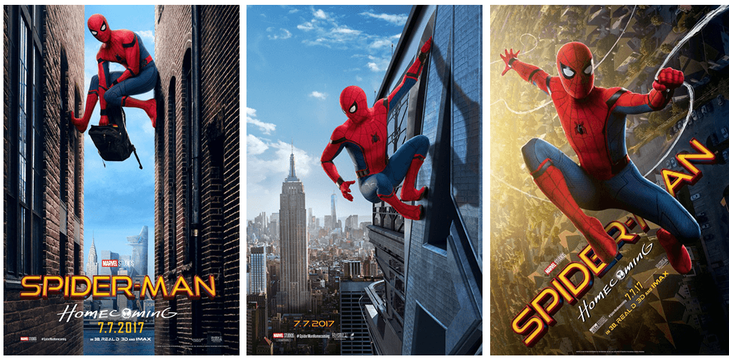
Spider-Man: Homecoming
I’ve been in love with the playful designs of the Spider-Man: Homecoming posters since they started dropping earlier this year. These posters look like they’re capturing discrete moments in Peter Parker’s life balancing things as your friendly neighborhood Spider-Man like hiding clothes in a backpack or getting ready to leap off a tall building along with being a regular New York teenager. I especially like one of the posters where Spider-Man is framed perfectly in the center of the image but the background is askew. The first time I saw it and noticed that, and realized the angle that Spider-Man’s really at and it literally made me a bit dizzy.
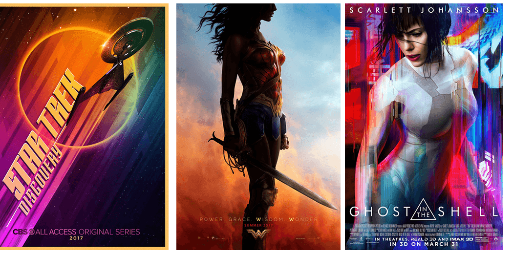
Star Trek: Discovery
I don’t know if it’s the colors, the blocky typography or the design of the USS Discovery on the poster, but I’ve been a big fan of the teaser poster for Star Trek: Discovery every since it debuted last summer.
Wonder Woman
I really wanted to include the teaser poster for Wonder Woman last year, but I like to include posters for movies in my best of review that premier in the same year as the review. So I sat on this poster for a long time. It’s so simple, with just a near-silhouette of Wonder Woman over an orange and blue sky with the words “Power Grace Wisdom Wonder” below. It’s practically the perfect poster for this movie.
Ghost in the Shell
The Ghost in the Shell movie might have been a disappointment at the box office, but this poster is anything but. It features star Scarlett Johansson becoming invisible via a suit utilizing futuristic technology over the garish neon-infested city the movie takes place in.
Legion
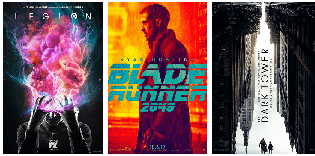
The poster for the FX series Legion, which features the mind of the main character of the series exploding into a nebulous pink/blue mass is the perfect summation for the awesome-weirdness that is this show.
Blade Runner: 2049
It’s interesting to see how the designers for the posters to Blade Runner: 2049 handled things since Ghost in the Shell deals with many of the same themes this film does. Here, they chose to focus on the main characters of the movie like Ghost in the Shell, but to present them in such a way that their photos are totally colored either an intense orange or blue with just the actor’s name and movie title below.
The Dark Tower
The minute I realized I was looking at a city upside down with the negative space of the sky actually forming another city outline from below with the characters of the movie standing in the sky as it were made this poster go from “oh well” to “oh WOW!” for me.
