2015 was a so-so year when it came to movie and TV posters. There were several strong poster designs in 2015, but in a year when dozens of movie and TV posters were released — there were only a few strong poster designs among the masses.
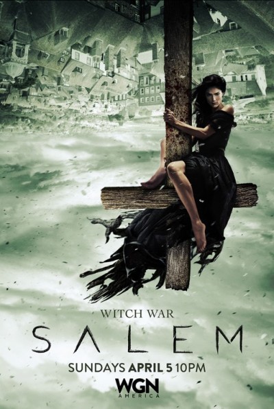
The best poster of 2015 was for the WGN TV series Salem.
Honestly, I don’t watch Salem. I tried but it’s not a series I could get into. However, after having seen one of the posters for the second season of the series it was an image that I couldn’t get out of my head and made me want to check out the show again.
The image features one of the witches of Salem perched atop the cross of a church. Except the poster is upside down and she’s not so much “perched” as she’s really hanging off the cross defying gravity. And with the image being rotated, off balance and the use of an inverted cross and all that connotes, I’m surprised the designers of this poster were allowed to execute this design at all. But they were/did and it’s one of the more striking images I’ve ever seen on a movie or TV poster in quite some time.
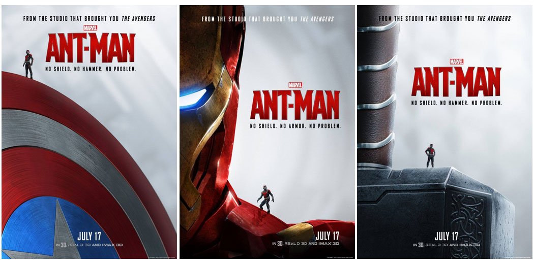
I can’t decide if I LOVE or HATE the poster campaign for the movie Ant-Man, but since I’m still thinking about it months after it was released I decided it needed to be on this list. The early posters for Ant-Man featured the title character who has the power to shrink atop Avengers things like Captain America’s shield, Thor’s hammer and Iron Man’s shoulder. It’s a neat way to both introduce the character to an audience who’s probably unaware as to who the character is, to show that he fits in with the other Marvel movies and even bring in some of the comedy elements to the film too since the photos feature a teeny-tiny man who has some large shoes to fill.

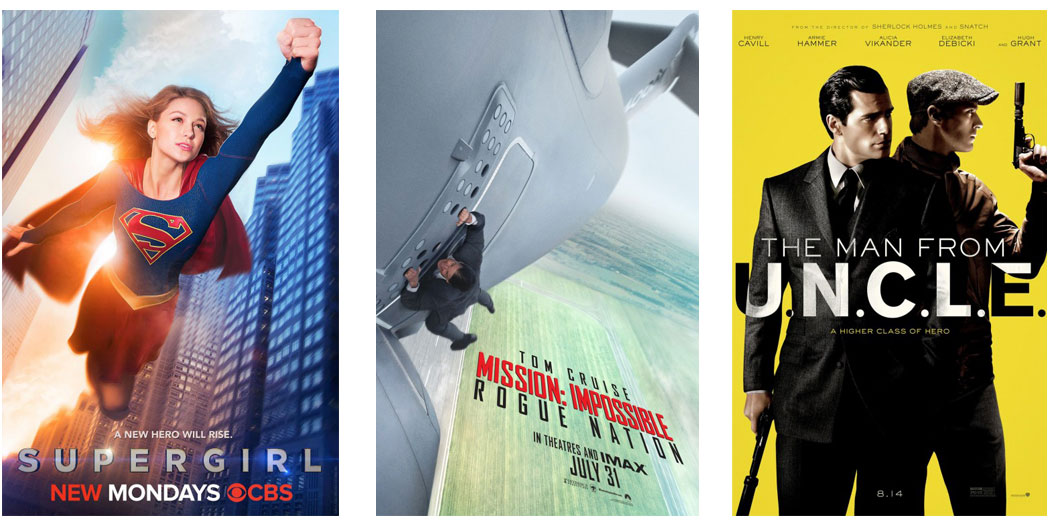
There’s a few things that I don’t like about the poster for the TV show Supergirl but there’s a lot more that I do like. The poster is simple, with just the title character swooping down between skyscrapers with a blue sky in the background. But it’s what this poster does so well that many other movie and TV posters fail to do; it sets tone and expectations for the series.

Another poster that I think sets expectations well is the one for Mission Impossible: Rogue Nation. Pulled straight from the movie trailer, the poster has lead character Ethan Hunt (Tom Cruise) holding onto the side of an airplane for life as it lifts into the sky. Where the tendency of most movie posters these days is to cram as much onto the poster as possible, from actor’s names to movie title to tagline to who the director is… the poster for Rogue Nation is one of the more simpler ones out there with just the movie title, release date and other minor legalese on it.
The Man from U.N.C.L.E. flopped at the box office, but that doesn’t mean that the poster promoting this film was a flop. Much like with the poster for Rogue Nation, the poster for U.N.C.L.E. takes the simpler is better approach, though not to the extreme that the poster for Rogue Nation did. Here, we get a shot of the two leads along with the title on a yellow background. And while the poster might not have a lot to it, the contrast between the two figures on a simple background makes this one catch the eye.

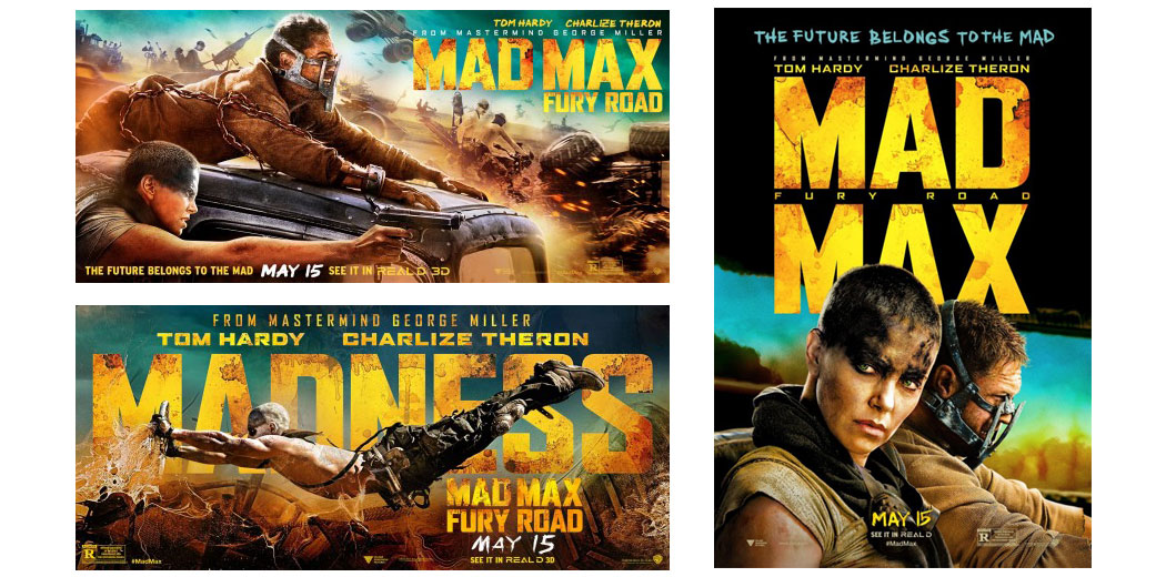
I really liked the poster campaign for the movie Mad Max Fury Road. Not only does it feature some nice images, but the contrasting warm/cool color combination and off-balanced layouts make these posters very appealing.
The posters for Fury Road are the question to the answer of how exactly do you sell a movie that’s a continuation of a series that’s been going on since the ‘70s? What the designers did here was rather than try and copy what was used in the past, to instead come up with something new that borrows from the look and feel from the film while at the same time showcasing the new actors in the Mad Max universe as well.