The last several years have been good ones when it comes to TV and movie posters. Even if the movies/TV series said posters were promoting didn’t always light up the box office/TV screens, none-the-less designers offered crops of nice posters to marvel over. And while this year wasn’t a “bust” whatsoever creatively, it wasn’t the best year for movie/TV posters either.
Still, there were a few nice posters to choose check out.
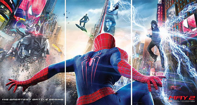
The Amazing Spider-Man 2
I didn’t like the movie The Amazing Spider-Man whatsoever. I didn’t like it so much I’ve yet to see The Amazing Spider-Man 2. But I don’t take into account how the movie did at the box office when making this list, just how the final poster/campaign turned out.
While the posters for The Amazing Spider-Man were dark and dreary, the posters for The Amazing Spider-Man 2 seem to be awash in bright, comic book colors. I really like how the action is portrayed on the posters. Sometimes we see Spidy’s back, other times he’s head on or from the side. Each pose is different and the action scenes are askew from the normal horizontal/vertical plane adding a lot of interest to the visual element.
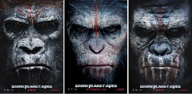
Dawn of the Planet of the Apes
The poster campaign for Rise of the Planet of the Apes (2011) was alright. Posters for that movie ranged from just the title of the film, to ape Caesar with his arm raised to a closeup shot of computer 3D created Caesar’s face. What was interesting with this Rise of the Planet of the Apes closeup poster was that the designers were confident that totally computer generated Caesar was going to hold up even at close viewing to warrant his mug on a movie poster.
And the designers of the sequel Dawn of the Planet of the Apes poster took this design element and ran with it, this time featuring closeups of Caesar as well as some of his ape minions on posters for that film. If the poster for Rise featured a somewhat pensive and curious Caesar, then the posters to Dawn features a much more mature Caesar who’s in charge and is not someone to be messed with.
Halt and Catch Fire
I’m a big fan of the TV series Halt and Catch Fire and was excited to see the series the second I saw the poster and other marketing materials for it. Mimicking the corrupted computer screen/something’s in the image even if I can’t quite tell what it is look of the opening credits to the show, the poster for Halt features the leads of the show on a red nuclear-blasted/neon landscape. The real kicker here is the tagline, “The battle for CTRL begins.”
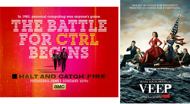
Veep
I thought the poster last year to the TV series Veep was one of the best of the year and think the poster this year is pretty darn good too. Here we have Vice President Meyer (Julia Louis-Dreyfus) and co crossing the Delaware ala George Washington. Except that whereas Washington’s crossing was presented as heroic, Meyer’s crossing is anything but. Some of Meyer’s staff members fawning over her, others checking their e-mail and some are trying to drown one and other with Meyer looking her best with the brilliant copy, “Boldly running for President, proudly standing for everything” above.
RoboCop
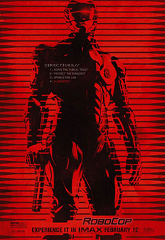 I try to avoid limited-edition posters that are more directed towards fans and collectors rather than the public since I don’t think it fits with the spirit of this list. But I thought that the limited Imax poster to RoboCop did deserve mention here. I love almost everything with this poster from its harsh two-toned look to RoboCop’s prime directives listed out on the poster.
I only wish more designers of the main posters for movies and TV series would take a cue from this RoboCop poster and try something different than to keep recycling what they’ve done in the past.
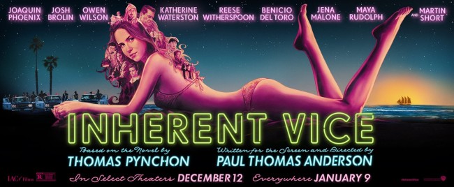
Inherent Vice
That being said – these days traditionally illustrated posters are the rarity rather than the norm they were a few years ago. That’s why I dig the poster for Inherent Vice so much. It’s hand illustrated to the point that you can see some of the brush strokes. While lots of limited edition posters are illustrated this way these days only a few mainstream ones are. Which, if how well the poster to Inherent Vice turned out is any indication, more should be.
