TV
Altered Carbon **/****
The domination of sci-fi continues unabated.
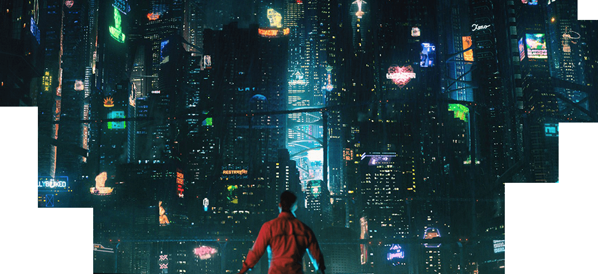
The latest sci-fi series to hit Netflix is Altered Carbon, a kind’a sort’a riff on movies like Akira, Blade Runner and Ghost in the Shell. I liked the first episode of this series if I thought it was a weak one.
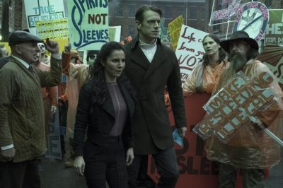 Altered Carbon begins at some point in the future on a far-off planet where some sort of military agents gun down a terrorist/freedom fighter named Takeshi Kovacs and his girlfriend. Flash forward 250 years further and Kovacs awakens in a new body, known as a sleeve, in San Francisco on Earth. In the future it’s relatively easy for people’s consciousness to be downloaded into new “sleeves” and Kovacs has been awakened to investigate an attempted murder. Well, that person’s sleeve was killed but they had a backup of their consciousness in the cloud and now wants to know who’s out to get him.
What follows is a bit long-winded as we as the audience knows that by the end of the episode Kovacs will certainly be investigating the murder even if he spends most of the episode denying that. At first, Kovacs doesn’t want anything to do with the case being a terrorist/freedom fighter and all but eventually agrees to take it when some hit-men come after him and know who he is even though he’s in a new body.
My big question is how is Kovacs even able to function in a society 250 years into his future? Just think of how things were 250 years ago in the 1700s and how a person being transported from that time to ours would react. It’s debatable on whether or not they’d even understand the language let along things we take for granted like electricity and running water let alone smart phones and the internet. And yet in Altered Carbon Kovacs is able to fit right into this world more than two centuries into his future without any muss or fuss.
Altered Carbon does take its cues from what’s come before and this isn’t necessarily a bad thing. Right now pop-culture seems to be in the mode of futuristic dystopian stories where our wildest dreams can be fulfilled yet we live in a digital hell ala shows like Black Mirror and films like Ghost in the Shell and Blade Runner: 2049. And Altered Carbon certainly uses themes and visuals from these movies as well as things like the mentioned anime Akira and yes even Ghost in the Shell again as jumping off points. The problem as I see it is that while Altered Carbon is neat to look at and everything is played to the nth degree on the “cool factor,” there was a lot going visually on but the story wasn’t quite gelling for me yet.
Hopefully, this is just a messed-up first episode where the creators of the show were so intent on telling a season-long first-season story they forgot to give the first episode a solid story within this overall narrative structure. This happens a lot with series where the rules of telling good stories episode to episode are forgotten in trying to tell a good season-long story. I think this may work for binge viewers blowing through many episodes at a sitting but since I don’t watch TV that was that I notice these things.
One episode in and Altered Carbon is good, I was just hoping for better.
A.P. Bio */****
I’m not sure what to think about the latest NBC sitcom A.P. Bio? On the one hand it’s got a lot of talent behind it from series creator Michael Patrick O’Brien who wrote on more than 100 episodes of Saturday Night Live, lead actor Glenn Howerton who’s a star and co-creator of It’s Always Sunny in Philadelphia but also had a nice role in the first season of Fargo and the series co-stars Patton Oswalt who’s good in practically everything he’s in.
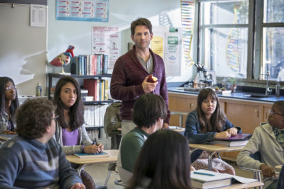 Yet I never felt that the first episode of A.P. Bio ever “clicked.” The plot here is that Howerton plays Jack, an ex-college philosophy professor now slumming it as a high school biology teacher in Toledo. Well, “teaching” might be too strong of a word since Jack really has no interest in that and instead wants to use his students to try and ruin another professor who Jack thinks got his job. There’s a question of how is a college professor allowed to teach high school, like did he first get his teaching degree before switching to philosophy and why do all the students in Jack’s class who should realistically be 14 or 15 instead look 24 or 25?
What’s weirdest about the show is that the Jack character seems to exist in a world without any consequences. In the opening scene he crashes his car into and smashes the sign for the high school then threatens a bike rider he nearly hit… yet the cops are never called nor does he lose his job when he pretty much tells the school principal (Oswalt) that he’s not going to teach. I feel like if maybe A.P. Bio had been a traditional three camera sitcom and all the TV artificialness that brings then the show might have worked, but as a single-camera one I don’t think it works very well.
The biggest problem here is that Jack is essentially the same character Howerton plays on It’s Always Sunny in Philadelphia, with maybe a few of the naughtier edges sanded off to appease network censors. That character once felt daring and new way back when that show started in 2005, but 13 years later he feels old and tired.
The Good Place second season ***/****
The Good Place isn’t like anything else on TV. On the surface this NBC series is a sitcom about four people lead by Eleanor (Kristen Bell) who thought in the first season they had died and had literally gone to heaven instead found that they’d actually gone to the bad place. And all of the crazy things that happened during the first season was actually head of their neighborhood in the bad place Michael (Ted Danson) trying to find new ways to torture them for eternity.

But when was the last time there was ever a sitcom that dealt with people trapped in hell and trying to find ways to become better people by doing things like studying philosophy to earn a spot in the good place?
There’s also the structure of The Good Place that’s different then the standard sitcom which I like a lot. Traditional, and even untraditional, sitcoms usually hold to the axiom where each episode is a self-contained unit. Stories don’t much carry-over from episode to episode which is perfect for syndication where shows usually air out of order at different times of day. But each episode of The Good Place is a chapter in its overall story. So viewers can’t just start with the second season of the show and expect to follow the story. They’ve got to start at the very first episode and watch each one from there which is terrible for syndication.
If The Good Place isn’t going to work in syndication, I do think it works extremely well on streaming platforms. There, the viewer can control what episodes they watch and can easily start from the beginning. And since each episode is a chapter in the story of The Good Place, I can imagine that the series would play out like one long four hour movie each season that’s easy to binge in a day.
In fact, it’s almost like The Good Place was designed for streaming/binging and I can’t think of another sitcom that’s like that.
Finally, The Good Place breaks the cardinal rule of TV sitcoms; the characters change. I don’t think Jerry Seinfeld, Sheldon Cooper or Claire Dunphy changed in any meaningful way from the first episodes of their TV series to the last/latest. But the characters of The Good Place have changed a great deal in the first two seasons of the show. At the start Eleanor was a self-centered woman who thought only of herself. Much of the first season’s focus was of her trying to become a better person but not quite being able to stop thinking about herself first. But over the course of two seasons she has started to change. So much so that in fact in this season she gives up a spot in the good place in order to stay with her friends who are still stuck in the bad one.
A third season is scheduled for The Good Place and I can’t wait to see where the show will go from here.
Jack Ryan promo
https://www.youtube.com/watch?v=V69XYIRjKww
Castle Rock promo
https://www.youtube.com/watch?v=fwmhiqUPa28
Movies
The Movie Chain: #5: Dawn of the Planet of the Apes (2014)
Last week: Zero Dark Thirty
The Movie Chain is a weekly, micro-movie review where each week’s film is related to the previous week’s movie in some way.
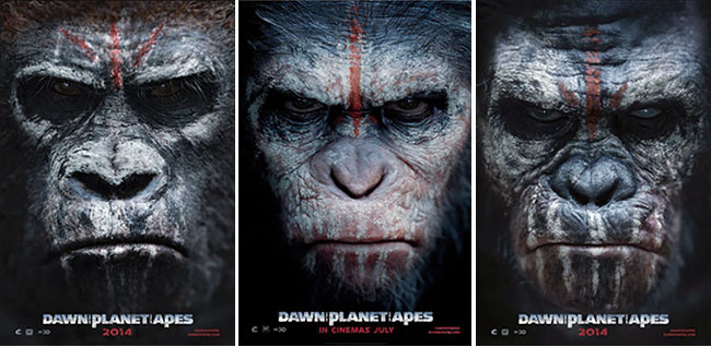
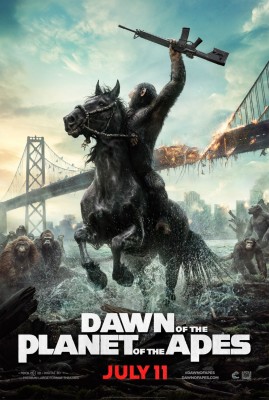 One of the more surprising movie franchises in recent memory is the reboot of the Planet of the Apes films, the second of which was Dawn of the Planet of the Apes. If the first Rise of the Planet of the Apes took place in a modern day where experimentation on apes accidentally leads to them gaining human-levels of intelligence, then this second movie is an all-out post-apocalyptic question of what happens when mankind cedes being the dominant species on the planet to the once lowly ape?
Jason Clarke who played a CIA agent in last week’s Zero Dark Thirty and Gary Oldman co-star as the chief human protagonists with Andy Serkis starring as chimpanzee Caesar, Dawn of the Planet of the Apes took the rebooted franchise in some interesting directions while at the same time paying homage to the original films. There’s not a lot of “camp” in these new Apes movies like there were in the original films, yet there’s quite a few nice little moments in them that call-back to the original films that so many still love today.
In Dawn of the Planet of the Apes the Earth has been mostly depopulated of people by the “Simian Flu” that killed most of the people but made the apes smart. And even though the cities are mostly abandoned and there’s miles and miles of nothing across the planet, there’s not enough room for both ape and man in San Francisco as the remaining survivors there begin to push into apes territory as they try and rebuild their lives. It all comes down to trust, can the apes trust the humans who tried their best to kill all the smart apes in the first movie and can the humans trust the apes who grow in number and power every single day?
Next week: Rich Man, Poor Man, Beggar Man, Thief.
Ant Man and the Wasp movie trailer
Mute movie trailer
Cool Movie & TV Posters of the Week
