The best posters of 2016 were for the movie Suicide Squad.
Suicide Squad
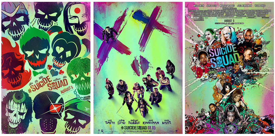
One of the ways I judge the best posters of the year is if I’d like to have them hanging on the walls of my office — and boy-oh-boy would I love to see the posters for the movie Suicide Squad hanging there. What I think works so well about them is they break a lot of design “rules” by using elements like hyper “acidic” colors — or colors that a painting professor I had used to say, “were so intense they hurt my teeth” — and diverging design components that you’re not supposed to use.
Which, in lesser hands, could make the posters look amateurish, but instead makes the ones for Suicide Squad stand out from the flood of superhero posters that have come before. Posters for similar movies have, not so much failed, as failed to live up to expectations, in that they all kind’a look the same. I don’t think anyone would mistake the Suicide Squad poster for, say, a Captain America poster. And in an industry that seems to generate lots of campaigns that look the same as every other poster campaign, the ones for Suicide Squad have a wholly unique aesthetic.
Arrival
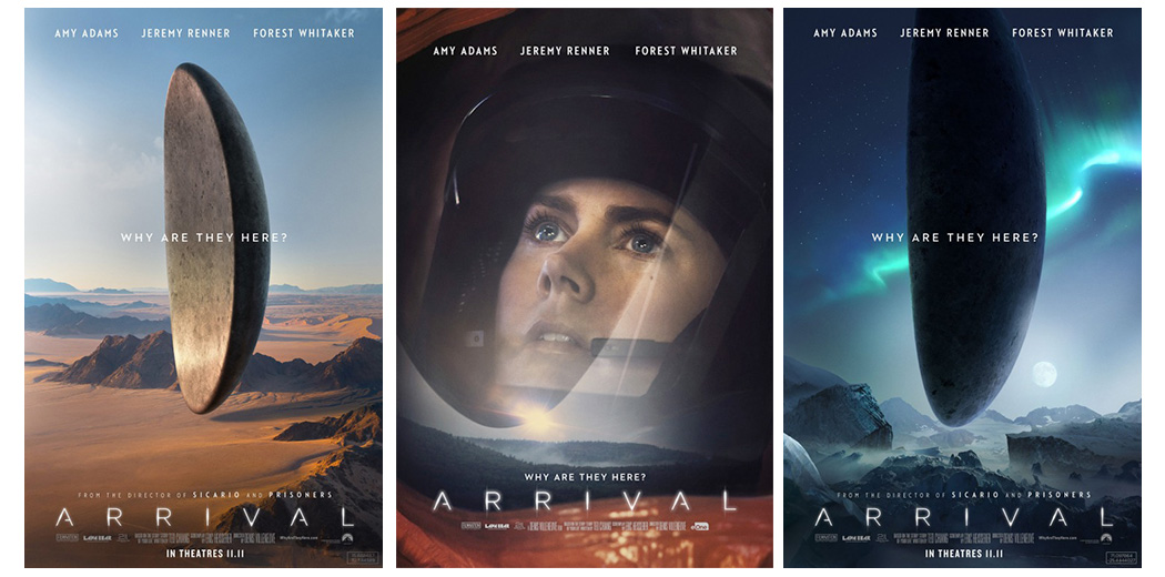
I am a sucker for sci-fi movies. I’ll give just about any movie or TV series labeled “science-fiction” a try as long as it looks interesting enough. And the posters for the movie Arrival makes that movie look reeeeeeeally interesting. They feature these colossal alien ships that look a bit like a cross between a squished hockey puck and a sunflower seed impossibly hovering in the sky. And the whole campaign puts these ships at different locals around the world which adds to the immense scale of the ships and the movie as well.
Better Call Saul
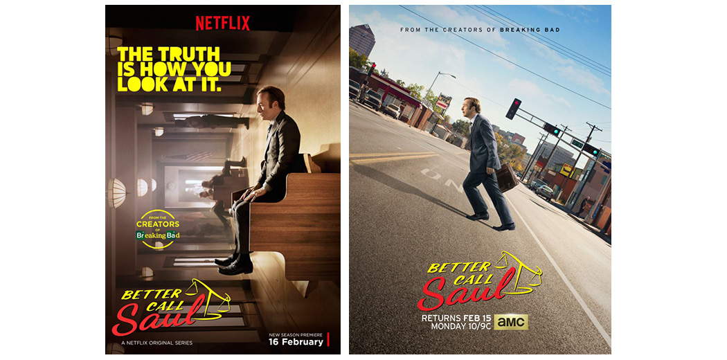
I’m a big fan of the TV series Better Call Saul and I only wanted to see the premiere of the second season even more after the release of these posters. Here, the character of Jimmy McGill (Bob Odenkirk) is walking across the street at a crazy angle, and it’s just him that’s being affected by the slant. I love all the taglines this poster could have but doesn’t. Like, “It’s not easy being bent” or even, “Becoming a criminal is an uphill battle.” And the poster for Better Call Saul on Netflix is just as good with Odenkirk sitting oddly on a bench with the tagline, “The truth is how you look at it” above.
Rogue One: A Star Wars Story
The poster for last years’ Star Wars: The Force Awakens was all right. It seemed to be a modern version of those classic Drew Struzan Star Wars posters of old, except that instead of Struzan traditionally illustrating the posters someone created a photo illustration. And while the poster for Rogue One is a photo illustration too, I think where that poster is unexpected whereas The Force Awakens is in line with what’s come before is that Rogue One has its own unique look and color scheme. So much so that I don’t think anyone could mistake it for another Star Wars film.
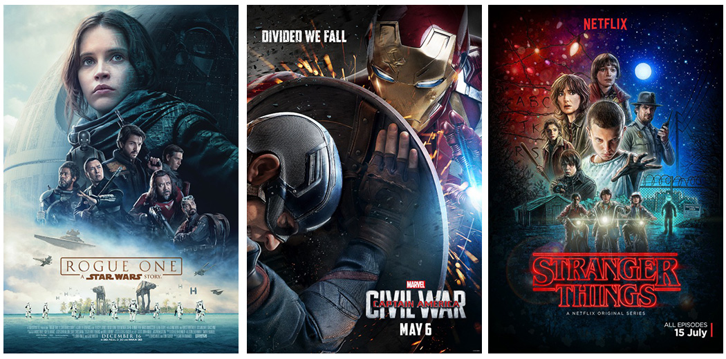
Stranger Things
The poster for the breakout TV hit of the summer Stranger Things is just as cool as the other posters on this list but in its own way. This poster is illustrated in the Struzan style and has just enough nostalgia factor that even if the series weren’t a good as it is I’d still be a fan of this poster.
Captain America: Civil War & Star Trek: Beyond
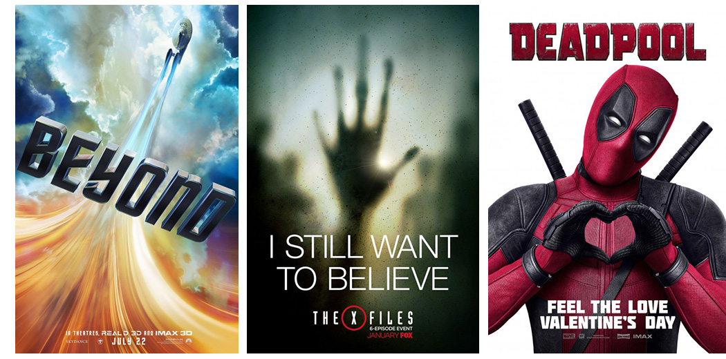
I thought the posters for Captain America: Civil War and Star Trek: Beyond were top notch too. The poster for Captain America takes a closeup shot of Cap and Iron Man battling each other from the perspective of Cap — and there’s a companion poster out there too that shows this action from opposite angle. And the poster for Star Trek: Beyond is so different then the other modern Star Trek posters while at the same time utilizing design elements from classic Star Trek posters that it’s breathtaking. Interestingly enough, the poster doesn’t have Star Trek anywhere on it, we just get the Enterprise swooping on a field of color with the words “Beyond” below.
The X-Files
The X-Files revival TV series might have been a bit of a mixed bag, but that doesn’t mean that the poster campaign released to promote the show wasn’t creepy as all get-out! “I still want to believe” indeed!
Deadpool
I don’t think I could call myself a true poster aficionado if I didn’t include at least one poster for the movie Deadpool on this list, the most PG of which features the title character making the heart sign with his hands with “Feel the love this Valentine’s Day” below.
