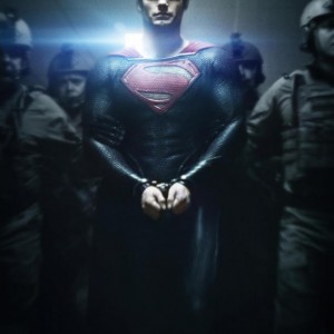
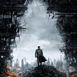
Not that I was hoping for much from the Star Trek: Into Darkness poster since the poster for Star Trek (2009) was so crummy, but I was hoping for more from Man of Steel. Look at how subtle the poster for the first Iron Man was, and even Thor. Then look at the ham-handed so overly Photoshopped it looks like a comp poster for Man of Steel. Heck, I even prefer the poster for Superman Returns over this.