The Best Movie and TV Posters of 2012
By Bert Ehrmann
December 7, 2012
It took a bit of digging this year to compile my "best of" list. Usually, the problem is that I find so many posters that I have to cull quite a few good ones just to make this list a manageable size, but not this year. This year the challenge was just finding enough posters for the list. I found lots of posters I liked, but only a few I loved.
Click on any of the posters for a larger view.
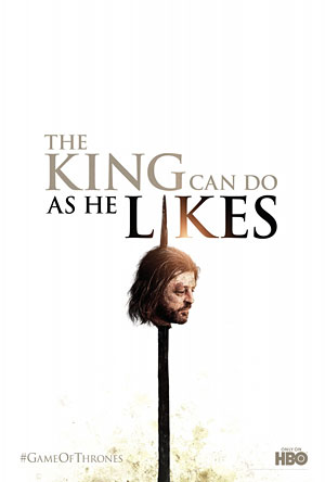
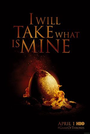
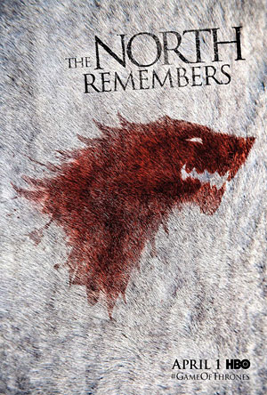
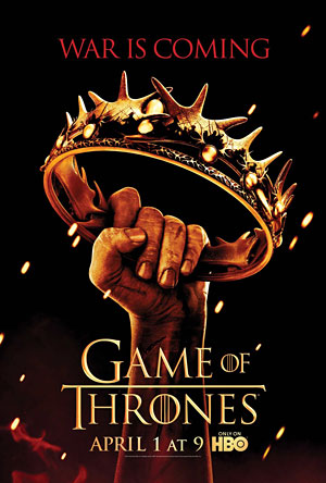
The best poster of the year is the series of posters released for the second season of the HBO TV series Game of Thrones.
These poster feature simple images from arrows in flight to a hand holding a crown along with quotes from the series. Everything from (spoiler alert) Eddard Stark's head on a pike with copy, "The king can do as he likes." To a dragon egg in the process of hatching with, "I will take what is mine," in gold above. My favorite of the posters is of an animal hide with a bloody design of a wolf splattered on it with, "The north remembers," written above.
The first time I saw that poster I literally got goosebumps and couldn't wait for the next season of Game of Thrones.
And I think the posters work for those who aren't already fans of the show and who don't know their Starks from their Lannisters too. They're so striking that I can't imagine anyone who's not into fantasy or sci-fi wanting to checkout the show after seeing the posters.
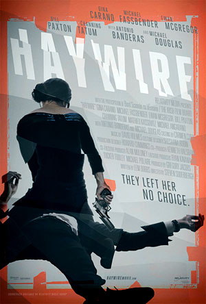
Not only did I love the film Haywire, but I really like the poster for the movie too. It's quite unsettling, from the choppy design elements used throughout or the fact that the poster depicts the lead female character Mallory (Gina Carano) straddling and dominating an incapacitated man, which is practically taboo in our society. The real zinger is the tagline, "They left her no choice." What's not to love?
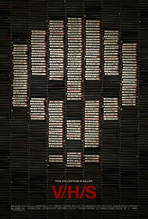
I'm not much of a horror fan and never saw the movie VHS. But I have to say that I really dug the VHS tapes and labels in the shape of a skull for the poster to that film.
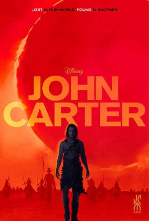
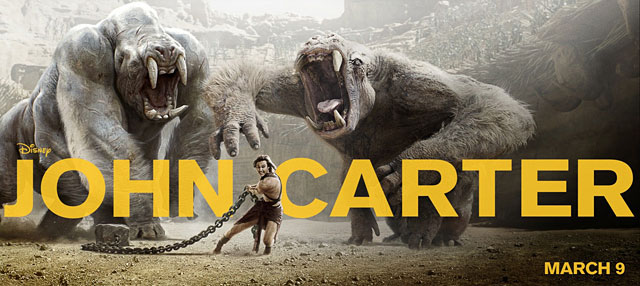
I think it could be argued that one of the reasons the movie John Carter was doomed at the box office was that the initial marketing materials that included a convoluted trailer and weak poster fell flat with the public. However, later posters and trailers for the movie were a marked improvement, a few of which I really dug. Some of these posters for John Carter depict both human and computer generated characters of the movie in action and locked in battle. The poster I liked the best harkens back to those cool illustrated pulp and paperback covers of old, with the lead character walking out of a blasted orange landscape with aliens riders coming out of the haze in the background.
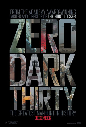
One last minute addition to this list were the final posters for Zero Dark Thirty. The movie's not out yet and isn't set to be in wide release until next year, but technically it's a 2012 release and I really dug the design of them with photos from the movie used inside the letters for the title of Zero Dark Thirty.
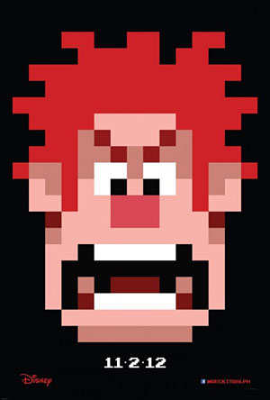
While I might checkout Wreck It Ralph one day on home video, it's not really the type of movie I'd see in the theater. However, I have to say that the initial teaser poster for the movie, that shows Ralph in all his 8-bit original Atari-like glory, is one I wouldn't mind tracking down and owning a copy of one day. I'm not a gamer, my limits at video games were met in 1988 with Super Mario Bros, but I've always had a lot of nostalgia for that early time period of Nintendo and Atari video games, and the poster for Wreck it Ralph perfectly played to those nostalgic strings.
Honorable mentions go to the posters for The Campaign, The Master, The Amazing Spider-Man and American Horror Story.
