The Best Movie & TV Posters of 2010
By Bert Ehrmann
November 19, 2010
I don't believe that 2010 saw the release of many great movie posters. In fact, when compared to years past, the design of posters this year has been lackluster at best. It seems as if in 2010 many of the designers of mainstream movie posters relied on essentially the same "look;" a shot of one or more members of the cast from the knees up. It doesn't matter if the poster was for a romantic comedy like The Bounty Hunter, a post-apocalyptic thriller like The Book of Eli or the teen-friendly The Twilight Saga: Eclipse each of those posters were a few among many that used a variation on the "knees up" photo.
I tend base this "best of" list on whether or not I'd want a given poster hanging in my home office. And, I can honestly say that for the most part I wouldn't want many of the posters that came out in 2010 anywhere near my walls. That being said there were a few poster gems this year.
Click on any of the posters below for a larger view.
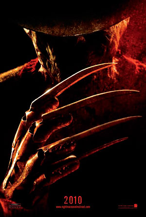
The best poster of 2010 was for a movie I didn't see -- the teaser poster to the remake of A Nightmare on Elm Street. I can't say that I'm a fan of the original Nightmare films nor do I much care for the overall recent spate of movie remakes. But I don't judge posters on the quality of the films the poster is promoting, just how well designed the poster is and the one for Nightmare is a doozy.
It's obvious that whomever created this poster realized that the real star of the Nightmare movies is Freddy Kruger, everyone else is a distant second. And by having the poster focus on Freddy, by hiding most of his scarred face in the shadows and by, more importantly, placing the main focus squarely on Freddy's glove, it shows the audience that yes, Freddy is back and he's here to do some damage. How perfect is it that I can detect just a hint of smirk on Freddy's face?
 |
 |
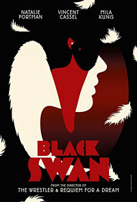 |
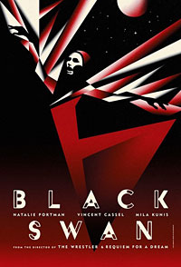
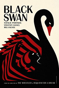
The rest: The posters for the upcoming film Black Swan bucks the trend for using photography on movie posters and instead goes with illustrations, and very simple illustrations at that. But that's exactly why these posters work. In a theater where most other movie posters are a mish-mash of colors and gigantic photos of actor's faces, a simple poster like those for Swan should really stand out in a crowded movie theater lobby.
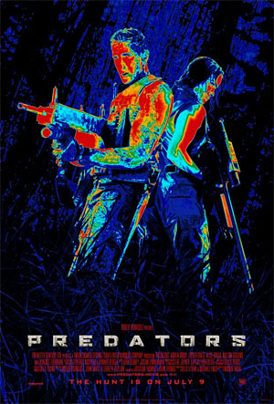
One of the many posters released for the film Predators falls into the "knees up" trap, but I'll forgive the designers of this poster for that. Much like with the posters for Black Swan, this poster uses a near-illustrated look. The designers of this poster used a heavily stylizing a photo of the actors and modifying the colors to look like the distorted views an alien Predator sees of our world. To a fan of the first film this poster is a loving homage to the original. To someone who's never seen a Predator movie I think this look would catch a glance and make the viewer give this poster a second look. No matter that Predators was dreck, this poster rules!
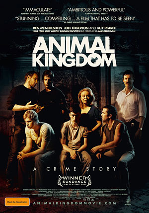
I love the fact that one of the posters promoting the Aussie crime drama Animal Kingdom is a sort of twisted family portrait with the chaos of the dysfunctional Cody crime family swirling around the character of "J." The design of this poster completely fits with both the tone and story of the Animal Kingdom film.
 |
 |
|
 |
 |
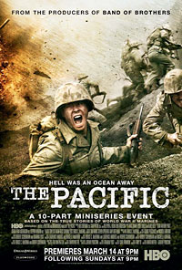 |
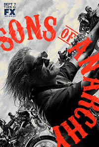
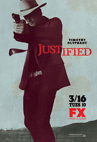
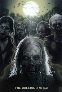
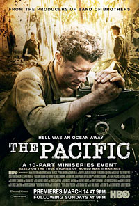
It's been said that modern TV series are eclipsing movies in terms of story and theme. It also seems as if posters promoting TV series and TV mini-series are on the verge of eclipsing movie posters in terms of originality of design. I'm not sure if it's the fact that posters for TV shows are usually selling a story rather than specific actors/stars, and hence movie posters that focus on star faces and TV posters that focus on design, but the level of creativity shown in TV posters, more specifically those for the series Sons of Anarchy, Justified, Rubicon, The Walking Dead and the mini-series The Pacific was astonishing this year.
Honorable mentions this year goes to posters promoting Inception, Iron Man 2, Jonah Hex, The Social Network and Skyline.
