The Best Movie Posters of 2006
By
Bert Ehrmann
2006-12-01
In recent years, the movie poster has taken a backseat
to other marketing media, namely television commercials and web sites.
It almost seems as if the poster has become little more than a way
for drivers to pull up to a theater to quickly gauge what's playing
and when.
But I think that movie posters are more than just ads for movies, in some cases they're pieces of art. I've had an interest in movie posters as far back as I can remember. As a child when I didn't have the resources to buy movie posters for myself, I would instead clip and save ads for movies out of the newspaper and looked forward to Sundays when these were printed in color.
Things changed after I got a job, though, and over the last decade plus I've been adding movie posters to my collection via the Internet and conventions since. This year I've decided to rate the best movie posters over the last twelve months. Please note, though these posters might be great, sometimes the films they're advertising are not.
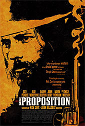 The best movie poster of the year was the poster to the film The
Proposition. Perfectly matching the overall tone
and theme of the movie, this gritty sun-blasted gnarled looking
poster looks as brutal and uncompromising as the themes in the
film. This poster even looks a bit like an old west wanted
poster, from the high-contrast black figure on yellow background
to the old-style font. The smoldering six-shooter is just icing
on the cake.
Since the film was originally released in Australia last year, there are actually two versions of The Proposition poster. The Aussie version is quite tame when compared to the U.S. version. I guess the Australians lucked out in getting to see the movie first, but at least we got a better poster. Larger view for The Proposition poster here.
The rest, in alphabetical order.
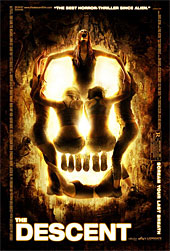
The Descent: The first of two disturbing posters this year, the poster to the movie The Descent depicts five females cowering together to form the shape of a skull. There is a palpable sense of horror in the image as the only female to face the viewer screams in (apparent) agony. A take on a Salvador Dali painting (which was also a hidden feature on the poster to Silence of the Lambs ), I can only imagine the uncomfortable photo session for this poster with the models all contorting their bodies to get the design and shape of the skull just right.
Unfortunately, the poster was much more interesting/frightening than this "by-the-book" movie. If you want to see strong female characters suddenly revert to screaming adolescents at the first sign of trouble, watch The Descent .)
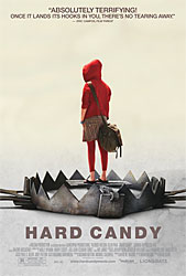
Hard Candy: The poster for Hard Candy is just as disturbing as the poster to The Descent , but in a different way. When I first saw this poster before watching the movie, I wondered just what the image was meant to convey? Is the girl on the poster caught in the trap or bait for it? The fact that this is also the theme to the movie is what makes this poster so stunning. Is the girl Little Red Riding Hood, or the Big Bad Wolf?
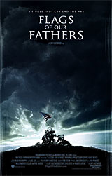
Flags of Our Fathers : The most simply designed poster of the bunch, the poster to Flags of Our Fathers presents the most iconic image in all of photographic history and places it front and center under a menacing sky. There's also a bit of weathering to the poster adding depth to the image. The tagline for the movie, "A single shot can end the war."
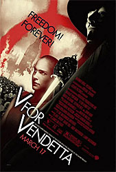
V for Vendetta: Another poster that closely follows the theme of the movie is the poster to the movie V for Vendetta . Here, character "V" is shadowed in black and stands to the right of the image, his dagger literally piercing the movie title. Adding a bit of the weathered look so popular to modern posters, the logo of the film appears to be spray-painted onto the poster behind character Evey. What I find most interesting is that the designers chose to angle the copy on the poster, adding a bit of unbalance to the image.
But much like the poster to The Descent , the movie V for Vendetta never came close to matching the power of the poster.
